

Good Design in the Digital Age
On taste, craft, and care in digital spaces

For a long time, I was drawn to architecture. Not just buildings as objects, but the act of designing spaces where people move through daily life. Spaces that quietly shape behavior. Architecture, at its core, is structured experience.
When you enter a well-designed building, something registers immediately. The proportions make sense. The materials relate. The space feels resolved. You do not need theory to understand it. It either feels intentional or it feels unconsidered.
Digital environments operate the same way.
When a website loads, the reaction happens instantly. Is this clear. Can I find what I need. Does this feel trustworthy.
Most users will never speak about typography or grid systems, but they feel when something is confusing. They notice hesitation. They notice friction. And they leave when the experience does not feel solid.
Designing digital products is, in many ways, not that different from designing architecture. Both shape environments people move through. Both influence behavior without explaining themselves. And both reveal immediately whether care went into their creation.
In my own work, designing digital products often begins with the opposite approach. Not with what can be added, but with what should be removed.
The goal is clarity.
Interfaces should guide quietly rather than demand attention. Motion should support structure rather than compete with it. Visual elements should feel intentional, not decorative.
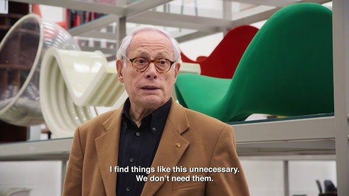
This idea is not new. Designers like Dieter Rams built their work around the same principle decades ago. His philosophy of “less, but better” was never about removing things for the sake of minimalism. It was about clarity. About designing objects that feel calm, useful and considered.
Curation becomes essential in this process.
Good digital products are rarely the result of adding more elements. They come from selecting the right ones and bringing references, influences and ideas into a coherent whole. The ability to curate well has become just as important as the ability to build.
This is where taste becomes visible.
As digital tools become more powerful, generating interfaces is no longer the real challenge. Layouts, animations and components can be produced instantly. What cannot be automated as easily is judgment. Knowing what to remove. Knowing what belongs. Knowing when something feels finished.
I approach digital products as spaces people move through. The goal is to shape environments that feel thoughtful and intentional.
A navigation interface from the Maison Margiela website reflects the direction digital interfaces should move toward. Motion supports the structure rather than distracting from it, and the experience begins to feel almost spatial, as if you are moving through layers rather than navigating a traditional menu.

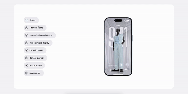
Another example is Apple’s recent product pages, where elements move softly within the layout and interfaces feel increasingly fluid. Information unfolds in layers rather than appearing all at once. The interaction creates a sense of depth, closer to moving through an environment than simply reading a page.
These kinds of interfaces reflect a broader shift already underway. Digital products are increasingly designed as environments rather than static pages, where interaction feels closer to moving through a space than navigating a screen.
E-commerce is evolving in the same direction. Stores are no longer just grids of products. Technologies like augmented reality allow objects to be explored in context, turning browsing into something closer to discovery.
With this shift, digital environments increasingly reflect the quality of the brand itself. The experience of a website or online store inevitably shapes how people perceive the products behind it. A refined interface signals the same level of care and intention customers expect from the objects being sold.
In that sense, digital products are no longer separate from the brand. They are part of the same universe. Just as a physical flagship store expresses a brand’s identity, digital spaces should communicate the same level of thought, craft, and attention to detail.
In the best digital experiences, technology almost disappears. The interface no longer demands attention. It quietly anticipates what the user needs. Navigation feels obvious. Interactions feel immediate.
What matters is not more features or surface variation, but clear decisions, defined structure and intentional restraint.
Just as a building reveals whether it was shaped with intention or built for speed, a digital product reveals whether it was constructed with thought or put together for convenience.
As interfaces evolve toward more contextual, voice-driven and agent-based interactions, the role of traditional UI begins to change. Visual layers become lighter. Interaction becomes more direct.
What ultimately defines experience is the quality of decisions behind it.
An Ongoing Dialogue
Curated is an ongoing dialogue, a living system of ideas exploring design, technology, and culture through curiosity and conversation.
I’d love to hear from you, what’s been inspiring you lately, or what’s been shaping your sense of taste? Reply anytime or contact me directly via Instagram or LinkedIn.
Thanks for reading. If this resonates, feel free to forward it to someone who cares about design, technology, and culture as much as you do.